Accessibility and ADA Compliance: Get ready, it is coming.

A client of ours was recently slammed with a lawsuit claiming their website was not consistent with ADA compliance.
It cost them dearly. The Americans with Disabilities Act regulations are designed to ensure disabled users can access the content of your website.
In short, what this means is that a user must be able to complete tasks by tabbing and “read” the visual content through a screen reader—all without using a mouse.
Through an audit, we discovered our client’s website was indeed lacking the functionality that makes a site ADA compliant.
They were facing a huge lawsuit, and we jumped right in.
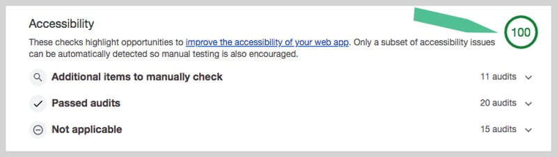
On the first audit, their pages ranked 53 on the compliance scale of 100. After completing the necessary technical work, their pages now rank 98+.
Website owners may want to get ahead of the accessibility issue.
This is a trend in the legal industry and the third time we have come across it in recent weeks.
Below, you can see the first audit results showing some of the non-compliant elements that needed to be addressed.

Below is a new audit showing the result after the technical work.
Remember, visually-impaired users cannot use a mouse.
Try navigating a site yourself with your eyes closed and see why this is so important to do.
Users with paralysis or motor impairments have the same problem. They must be able to navigate a site and perform a task without using a mouse. They do this by using the tab key to get around. For more details and the regulations, get the toolkit on the ADA website here.
Here are a few of the main ADA compliance issues we see most often in our audits:
1. Missing alt text on images
This is a big one. Often, content managers skip the step of properly labeling images. If you don’t, they will default to the file name, and look something like this: images-41608000-202644114262-1-originalV4
This is what a screen reader will read. Really. For those who can’t see the image, this is a nightmare. Instead, the image should be labeled “Upside down feet wearing polka dot socks”. (If indeed it is an image of that!) Make your description unique, clear and paint a picture with words.

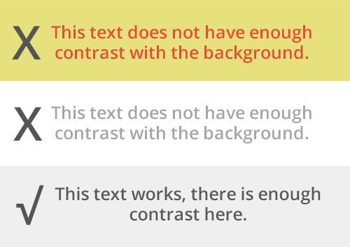
2. Low contrast text over backgrounds
It might look cool to have light grey text on white, but it is too difficult to read. Same goes for non-contrasty enough text colors or links on colored backgrounds, such as orange text over grey. From a design perspective, ADA compliance presents some challenges and compromises have to be made. For instance, one of our audits did not pass with red text over a very light grey background.
3. Buttons and links without discernible names
Interactive elements like links and buttons should indicate their purpose and state it in text form so the screen reader can read it. Saying “Click here” is not as helpful as “Click here to buy socks”.
4. Navigation elements without a logical tab order.
In other words, the flow of information should make sense and visually disabled users use the TAB key for navigation. If a website is selling socks, the flow should enable the user to tab through and buy them by bypassing other sections less important to purchasing, like the about us page. It is possible to achieve this in the code.
5. Not having proper headline hierarchy
Good headline structure helps the reader get to the content they want more quickly. Just like all users do, they scan. Like a book, the main headline is like the book’s title and the chapters are separated by a sub-headline. Chapters under those are the tertiary headlines.
It sets an outline for the page content that is scannable.
We also use programming techniques to skip some elements and jump to priority areas of a page.
Check out our article on perfect HTag Structure
6. Ignoring off-screen elements.
Sometimes, things like a sidebar “disappear” on smaller screens because of responsive technology, but a screen reader still sees them in the code. This has to be addressed as well, by either moving it, disabling it or skipping over it in the code.
There are more accessibility issues to address, of course.
Remember, the idea is to improve usability. After all, this is all about the experience our visually-challenged friends have when they use our websites.
ADA Compliance and SEO
It is worth mentioning that ADA compliance guidelines are actually in sync with search engine optimization (SEO) techniques. For instance, providing Alt text on images makes sense, so that when you can’t see the image, there is text to describe it. Links that say what you are linking to is also an SEO strategy. So, not only do you benefit disabled users, you get a boost too.
Making accessibility reviews a regular part of your maintenance process is a great way to improve your UX.
Performing an audit will show where the issues lie and need to be addressed. We are scheduling complementary audits, so give us a call and see where your website ranks.
Be ready! ADA compliance is coming.